Friday, May 30, 2014

Father's Day Card for a Honey of a Dad

When I saw the Tim Holtz honeycomb die I didn't hesitate for even a second and popped it into my shopping basket at Ben Franklin Crafts.  This die coordinates with so many of the other hexagonal products that are sold at HouseMart BFC.  I started making this card by die cutting eight honeycomb pieces from light brown textured card stock.  I ran all eight pieces through my Xyron to apply a sticky adhesive.  I pressed seven of the pieces together to make the shallow boxes for the Martha Stewart microbeads (from a set sold at BFC). The last piece I pressed onto a piece of clear acetate to form the cover for the shaker box (trim off extra acetate).
The honeycomb shaker box was adhered to a piece of decorative card stock from a 6x6 MME pad (Traveller) and then cut out with a craft knife. Next the compartments were dusted with cornstarch to help the microbeads roll better.  Then the beads were added and the cover was glued on.  The base of this card is shaped like a file folder which I made with a few straight cuts and corner trimming.  It is 4-1/2 x 6 including the tab.  I wanted it to look like a small version of a real folder because my children's father has stacks and stacks of them.  He organizes everything....just the opposite of me! LOL!  (There are mini Authentique  file folders available at BFC and they are really inexpensive, but I didn't want printed ones.  I tried stamping on the cover of the file folder but I didn't like the result so I covered it with DP from the same 6x6 MME pad. The ink soaked through the file folder so I had to cover the inside too.  I guess this is what is called a happy accident because I loved the way it looked with the printed paper.  Because my husband is a very frequent world wide flyer, most of the papers from the pad were appropriate.
The date tab and the honeycomb grid on the inside of the card were die cut using pieces from the two new Sizzix Life Made Simple sets. I only glued down the inner and bottom sides of the honeycomb grid so that photos can be slipped into the flap. (A few of the hexagons did not fall out of the grid but I just left them on because it somehow looked more interesting like that.)  To finish the card front I cut out two different sized hexagons (using the Spellbinders set) from scraps of the DP and inked the edges with TH Distress tea dye ink. After double sticking (Merikan tape) down the hexagons, I adhered the honeycomb shaker box on top. To finish off the look I stamped the letters 'r', 'a', and 'd' onto the hexagon shaped scraps using white then yellow ink.  These hexagon letters were then fit onto the card front.  Did you get why I used the letter 'r'?  (It's shorthand for 'our'.)
Although I purchased lots of beautiful Authentique Father's Day stickers and die cuts for this card, I only ended up using one small 'Father's Day' Authentique paper piece on the tab for this card.  Oh well, I'll use them for another project. The important thing is that I was very satisfied with the end result of the card.  Everything on the card represents something about my husband who is the  World's Best Dad.....patient, giving, wise, funny, and hard working.  Even the shaking microbeads match his inability to sit still and do nothing for even a few minutes.  I hope this card inspires you to make the 'perfect' card for the 'perfect' Dad in your life.  Father's Day is June 15th!

Sunday, May 25, 2014

Upcycled Chocolate Tin


Hi, I'm back again with another upcycling project.  This time I'm  re-inventing a chocolate tin.  Trader Joe's chocolate is delicious, but truthfully I buy them for the cute tins with the portholes.  I knew that I could decorate them by just gluing a pretty paper circle over the top, but I really wanted to showcase the fact that these tins have a neat window.

I also wanted to find another use for the beautiful washi tapes that I have in my 'collection'.  Here is what I came up with.... a tinful of tags!  Can you find the washi tape?  Yes, it's around the base of the tin but I also used it on the accordion pleats (on the tin cover) and for the rosettes on the tags.


To make the rosettes on the tags, I adhered two regular width strips of printed washi tape to some computer paper (yes, used paper is okay) and added two more thinner solid blue washi tapes on the top of the first two strips.  Then I used the rosette die to cut out two pieces (see bottom photo) and accordian folded them into rosettes that I glued (using Beacon 3 in 1)  onto a base flower (cut with a die from the same Sizzix die set). This piece was then glued onto another larger flower shape (also cut using a die from the set).


The rosette flowers were then glued to a floral printed circle and made into tags by punching holes and adding twine.  The cover of the tin was decorated with five accordion pleated pieces. I covered the words on the bottom of the tin with a solid colored card stock circle. Since the edge of the tin cover was a pretty turquoise I just left it unaltered. (This tin once held TJ dark chocolate wedges.)

Even though Ben Franklin Crafts sells several rosette die sets, I used this one because the finished rosettes are not too thick so I could fit five tags into the tin.  (The photo shows what the die cut washi computer paper strips look like before they are pleated.) Ben Franklin Crafts sells lots of pretty washi tapes and twine so go get some and see what you can create.  If you liked this post, please leave a comment.  I love hearing from you.

Wednesday, May 21, 2014

Upcycling and Crafting

  Upcycling is a term that I prefer to 'recycling' because I want to repurpose items that might have landed in the trash, but I want to make them better not just reuse them.... hence the word, 'upcycling'. Recently, I read a copy of the magazine, GreenCraft, and was inspired to take another look at everyday items that I would normally throw away. This empty pouch once held underwear (Costco) and it seemed perfect for upcycling, so I decided to turn it into a usable mini-tote.
Alright, gluing on some flowers doesn't seem very creative even thought it did hide the words.  I don't enjoy making multiples but I do like card sets so doing a group of five seemed manageable.
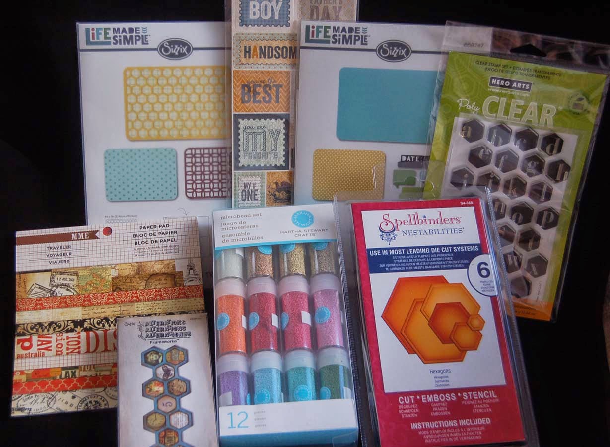
The pouch was just the right size for a set of five A2 cards.  (Paper Accents ten turquoise envelopes and cards were purchased from Ben Franklin Crafts)
I decorated the back of the pouch too because it also had the words.  I used Goo Gone to remove the sticky residue from the paper labels on the original pouch.
Here are the five cards in the set. Notice that each one is slightly different and each has a stamped word from the Paper Smoochies set. (Great company to order from because they are fast, accurate, and sometimes include a freebie!)
The decorative papers used on these cards are from my stash of oldies (Bo Bunny and American Crafts). The Prima paper flowers with the candy dots (Peebles) added are from my really ancient stash but they're still useable....ain't hoarding great?
I used a bookplate from a Sizzix holiday die set which inclued some tag shapes.  I use this die often because the bookplate can be attached with twine (like I did) or tiny brads.   After the recipient of this gift uses up the cards, I hope that she uses that pouch as a travel tote for make-up or perhaps dainty undies.... hahaha!....that would really be recycling (pantie packaging to pantie pouch) AND upcycling!

Saturday, May 17, 2014

Shake It Up Birthday Card

After watching Emily Leiphart's video (on her blog, Art from the Heart), I couldn't resist making a shaker card too.  I finally got hold of some sequins so of course I had to use them in this card.  You can't see from the photo but the pink dotted paper is iridescent too.  Rather than using foam tape to form the recessed area for the sequins, I die cut 4-5 pieces of pink cardstock and glued them together.  Normally I would just die cut one piece of foam core or cardboard, but the die I used was too thin (to cut through them) so multiple layers seemed to be the best solution.  I taped the acetate behind the water print ( from American Crafts 6x6 pad, available at BFC) die cut frame, then taped the window to the glued pieces of pink cardstock using Merikan double stick tape, and taped the stamped and colored Art Impressions image onto the pink polka dot panel, added the sequins, and taped the acetate frame down over the pile of sequins and the colored image. This was all easy and less complicated than my long wordy explanation.

On the inside of the card I attached the shaking booty (using the spring that came with the stamps) and attached the die cut words (Sizzix set from Ben Franklin Crafts).  I really enjoyed making this card (because the discovery of gluing the cardstock frame pieces together to make the area for the sequins, made the whole shaker card making process much faster and neater).  

I hope my friend, who exercises religiously at the Y pool, enjoys this card.  Yes, I did tell her that the old lady in the bikini and her shaking booty are mine, not hers.....never insult the birthday girl!


Tuesday, May 13, 2014

Retirement Card

For a change I decided not to make a card with fussy cutting or a ton of embellishments.  I kept it simple and just had fun practicing my watercoloring technique (?).  The Art Impression line of stamps are easy to color with color pencils and an aqua pen.  Basically, I just followed the  colored sample on the rubber stamp package, using my grey color pencil to do some of the shading. (Sorry the photo is not the best.)
As usual I had a few smudges of color, so I covered them up with a spray of color mist (Mister Huey or Fireworks).  Because the recipient of this card (my sister) expressed a desire to do some crafting with her newly acquired free time, I decided to show her (on the inside of the card) what will happen to her if she does.  Life gets messy when you become a crafter (right?) but you just have to embrace the disorder.  Thanks for stopping by and if you have some time to spare, please leave a comment. I really enjoy reading them.


Friday, May 9, 2014

2014 Graduation Card

This year our family has three graduates.  I wanted to make a different card for each one, but alas, time ran out so I designed a card that was appropriate for all of them.  I used the Sister Stamp of a graduate so loaded down with leis you can't tell if it is a boy or girl....LOL!
I started with an 11" x 5-1/4" piece of lightweight watercolor paper. I scored it at 3-1/2" and 7".  Then I folded back the front panel so that the open edge would be on the left side of the card front.  The reason I chose watercolor paper was because I planned to stamp and color directly on the card (thus eliminating fussy cutting) and the watercolors/ink won't bleed through the watercolor paper.  I used watercolor pencils and an aqua pen (the type with a water reservoir). (Oops!  I forgot to show the watercolor set I bought from Ben Franklin Crafts.) I find that the pencils are easier to work with than the tube or palette style of watercolors because the details can be just drawn in and painted over with the aqua pen....no need to even wash the brush between colors.  Also boo-boos can be covered over with just a few strokes of blue pencil....see photo LOL!
The word 'GRADUATION' (from the Dandelion Design set)  and the rainbow side strip were colored with my Splendor Tsukineko pad that is so ancient it may not be for sale any more.  The words 'happy' 'happy' 'happy' proved to be a bit harder to ink as it is very close to the 'GRADUATION' so I used some duo daubers (yes, I still have some of those in my stash too, LOL!).  (If you keep your ink pads sealed in Ziplocs or Iris containers, they will last for years....really!) Finally, for the acetate window I ran a piece through an Darice embossing folder and colored in the recessed design with a gold gel pen (the same one that was used to add gold highlights to the card). The windows on the card front were easily cut with the Spellbinder die (from BFC) and the magnetic platform (which holds the die in the exact place where you want to cut the window).  I used the Dandelion Designs 'congrats' on the inside of the card and photographed some stamps that I did not use on this project...oops! again. Okay, that was it for this graduation card except for repeating the process two times and sending them out with leis and $$$.  YAHOO! YIPEE! HOORAY!

Monday, May 5, 2014

Boy's Day Card and Contest Winner

Happy Boy's Day everyone!  I had to rush on this card because after coming home from Japan I had to recuperate from the trip, unpack, and recover from a cold.  Happily, I got this done just in time to send it (and its twin) off to my sons.  On this card I combined a Sister Stamp (for the cute boy image) and the fish/ribbons/words from a Dandelion Designs stamp set.  I used a Darice embossing folder (not shown in photo) to impress the bamboo design.  Pop-dots were placed under the fish and boy to add more dimension.  I was very happy to be able to use a bit of the printed washi paper that I just purchased in Japan in anticipation of creating this card.  To bring out the gold of the paper more I added (with a gel pen) some gold ink on the ribbon and around the words.  Of course, I wish that I had thought to buy more than a few small sheets of this washi paper because who knows when I'll find this flying carp design again. Remember Lynn's rule: Buy it when you see it because you never know when you'll get another chance!  Oh well, I couldn't bring home all of Japan but I did try real hard....LOL!
Thank you to all who entered my 'Where in the World' contest.  Surprisingly, the winner had the answer in about an hour.  Congrats, Sharon O!  Please send your mailing address to me at lsakami@aol.com and I will immediately send you a gift pack of goodies from Japan. Sharon correctly identified the tea plants in my photo and pinpointed that the plantation was in Shizuoka, Japan.  We chose to visit that area to tour the plantation and museum.  Although it was not harvest time (the harvesting machines cut the bushes in that rounded shape), we had a great time and learned a lot about tea.

Thursday, May 1, 2014

Where in the World?


 It's contest time! Do you recognize this plant?  Then maybe you can guess where I've been for the last few weeks. (Sorry bloggers while traveling I was able to read your wonderful posts but not comment by iPhone.)  Perhaps with a little detective work on the internet you can make a reasonable guess and win some great prizes from that area.  The challenge is to figure out the area (city and country) where these plants are growing.  If you can identify the plants it will help you to figure out the place.  The first person to correctly identify the city and country and post it in a comment to this post, will win the prizes.  You will have to send your mailing address to my email address IF you win so you need to check back to this blog to find out if you did.  Good Luck!